
Transportation maps are ubiquitous throughout this world. Any city operating a metro, train or subway system has a map to guide the users through the network. The presence of these maps were much more important in the pre-smart phone days; however, there is still value in having a good transportation map on mobile devices.

Berlin suburban railway network. Source: Berlin.de
Designing maps for transportation networks
Have you ever wondered how transportation maps are designed? Possibly not. But, the most intuitive answer is that someone has sat down and painstakingly devised this map. This is likely to be the correct answer in a lot of cases.
Originally, transportation maps were hand-drawn, but were closely related to their geographical representation. It has only be a recent idea to design transportation maps without any great link to geography. In fact it was not until 19311 that the London Underground changed from a map that was geographically based to the iconic map we see today.

London Underground geographical map. Source: Nick Balstone, CC BY-2.0
Looking at the geographical layout of the London Underground above, it is understandable why a more stylised map, like the Tube Map, would be preferable by users and operators. While not geographically correct, the stylised, or topological map, contains all of the information required for using the rail network without making it unreadable in the dense inner city areas. The extent of the difference between geographical and topological maps is discussed in an article by The Guardian. However, it is important to note, the the purpose of topological maps is not to be geographically correct, but to make the use of the transportation network simpler.
I am not here to talk about the need for such maps specifically, the purpose of this blog is to highlight the use of optimisation to create the stylised, topological maps for transportation systems. There are two types of maps where optimisation has been used. The first is to create a map like the Tube Map, and the other is to improve the representation of transportation routes on geographical maps, such as Google Maps and Apple Maps. I will predominately focus on the former, and touch a little on the latter at the end of the blog.
Rules for creating transportation maps
Most of this blog is based upon the work of Martin Nöllenburg and Alexander Wolff, and in particular their article Drawing and Labeling High-Quality Metro Maps by Mixed-Integer Programming. The reason for using this article is because it nicely describes the constraints of the problem in a way that is easy to understand. An additional interesting aspect for me about this paper is that the map they create is for the rail network in Sydney, which is where I lived for a number of years.
Nöllenburg and Wolff2 present 7 rules for the creation of transportation maps, which are
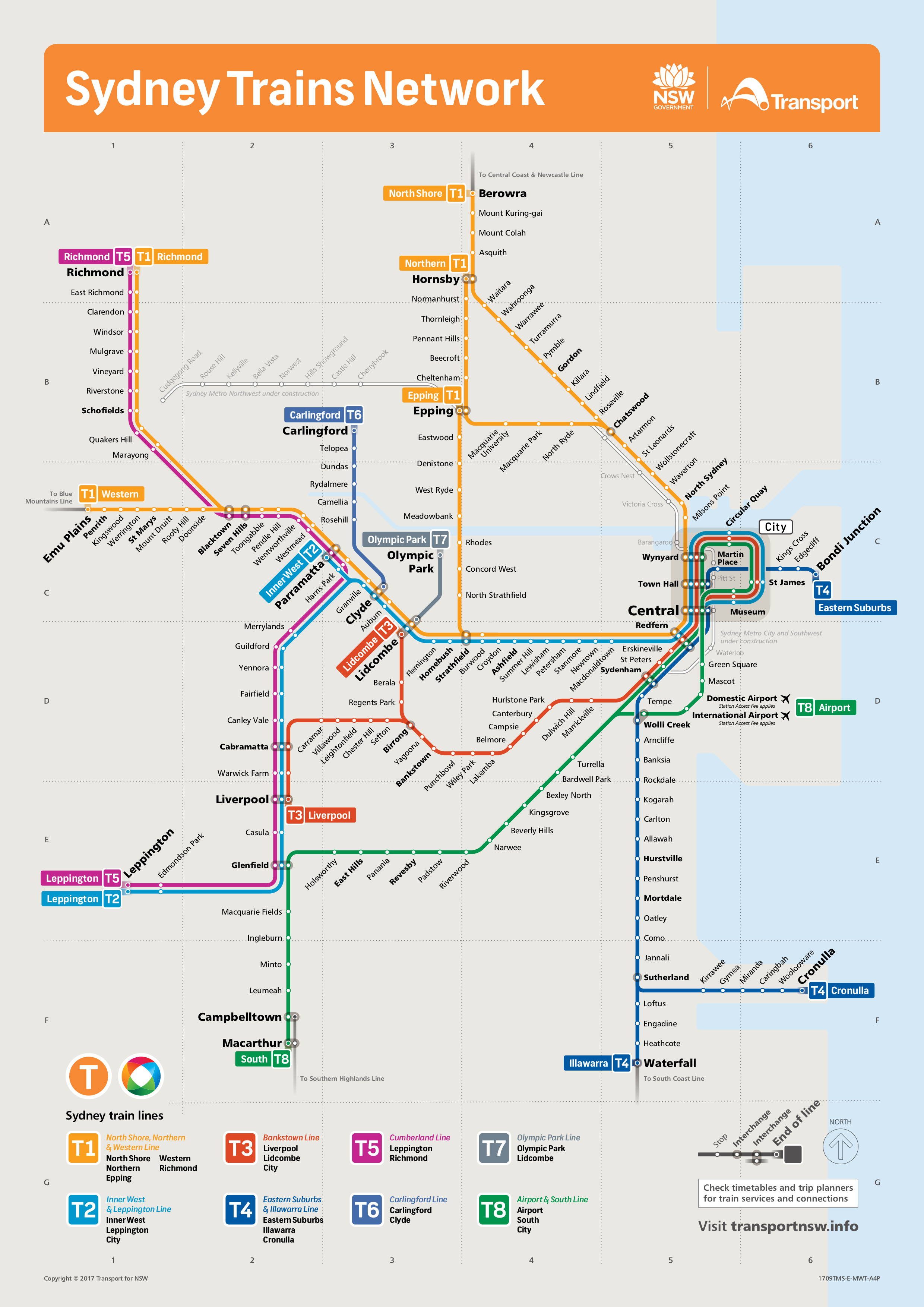
Sydney Trains Network. Source: Sydney Trains
- All line segments must be vertical, horizontal or on a 45° angle.
- The geographical layout should be preserved as much as possible.
- Avoid bends along individual metro lines, especially in interchange stations, to keep them easy to follow for map readers. If bends are necessary, then larger angles are preferred over tight angles.
- Preserve the relative position between stations to avoid confusion with the mental map. For example, a station being north of some other station in reality should not be placed south of it in the metro map.
- Keep edge lengths between adjacent stations as uniform as possible with a strict minimum length. This usually implies enlarging the city centre at the expense of the periphery.
- Stations must be labelled and station names should not obscure other labels or parts of the network. Horizontal labels are preferred and labels along the track between two interchanges should use the same side of the corresponding path if possible.
- Use distinctive colours to denote the different metro lines.
It is possible to see each of these rules in action when looking at the rail network for Sydney. There are very few bends, and all of the line segments are either vertical, horizontal or on a 45° angle.
The difficulty of this problem is putting all of these rules into an optimisation problem that can be efficiently solved.
Constraints for mixed integer program (the optimisation model)
The rules presented above are used to form hard and soft constraints. In more general terms, a hard constraint is something that must be satisfied by the solution to the optimisation problem. Where a soft constraint does not need to be satisfied, but there is a penalty for violating the constraint. In some cases, a soft constraint may not be a constraint at all, but a penalty for an undesired property of the solution.
The hard constraints for the map generation model are related to the more strict drawing conventions, and are given by rules 1, 2 and 5. However, rule 5 is broken into two parts, the first is a hard constraint of a minimum length between two stations, the second is a soft constraint that we will address later.
The soft constraints model rules 3, 4 and 5. Rule 5 requires a soft constraint on the maximum length of an edge between stations. This maximum length reduced by minimising the sum of all edge lengths in the graph. The modelling of the soft constraints is an interesting aspect of this problem. As mentioned above, soft constraints must penalise any violation, so this means a cost has to be devised corresponding to the violation of the constraint.
- Rule 3: avoid bends. This is achieved having an increasing penalty for each 45° away from horizontal. Starting at 0 penalty for 0°, then 1 for ±45°, 2 for ±90° and 3 for ±135° (it is not possible to have an angle of 180°)
- Rule 4: preserve relative position. A penalty of 1 is given to an edge that does not use the direction closest to the geographical direction of the edge.
- Rule 5: minimise the total edge length. Sum up all of the edge lengths in the resulting graph.
The objective function for this optimisation model minimises the weighted sum of the costs from these three soft constraints.
The results
Below are three maps that have been created for the Sydney Rail network using two different methods. The last of these three has been created using the method described above. As you can see, the formulation of the problem can have a significant difference to the quality of the map that is created. The second map is much closer to that used by Sydney Trains.

Source: Hong et al.3

Source: Nollenburg and Wolff2
Another aspect that these maps highlight is the improvement in technology. The map of Hong et al. was created in 2006, while the map of Nollenburg and Wolff was created in 2011. It is conceivable that as we improve mixed integer programming technology, that it will become possible to automatically generate transportation maps.
Automatic transportation maps for geographical maps
Online maps are a valuable tool, especially for personalised navigation. To aid the visualisation of navigation results, online maps provide some representation of transportation networks. Since these representations are overlaid on a geographical map, they should not deviate greatly from the real networks. As such, this is a very different map generation problem than that presented above. However, it is still important.
A couple of years ago, Transit announced that they had the most beautiful transportation maps for online maps. This is a fairly bold claim. However, if you look through their article, it is clear that Google has been really lagging on the representation of transportation networks within their maps.
What is interesting about automatically generating transportation maps for online maps is that there are some parallels with the generation of topological maps (which were described above). For instance, the loop in the centre of Chicago has many train lines running around it, meaning that there is the potential for overlapping or crossing, which could make it difficult to visualise. Reducing these crossings appear to be a big part of the effort from Transit in creating their maps.
Transit explain a bit more about what they have done to create their maps in a Medium article. They went to a lot of detail to explain the different steps in producing their transportation maps. In this explanation, they also say that a mixed integer program was used. Unfortunately, there is no further information about the optimisation model they solved is provided. However, it is good to see that mixed integer programming has a place in automatically generating transportation maps for online maps.
Footnotes
1. Tube Map – Wikipedia
2. Drawing and Labeling High-Quality Metro Maps by Mixed-Integer Programming
3. Automatic visualisation of metro maps
